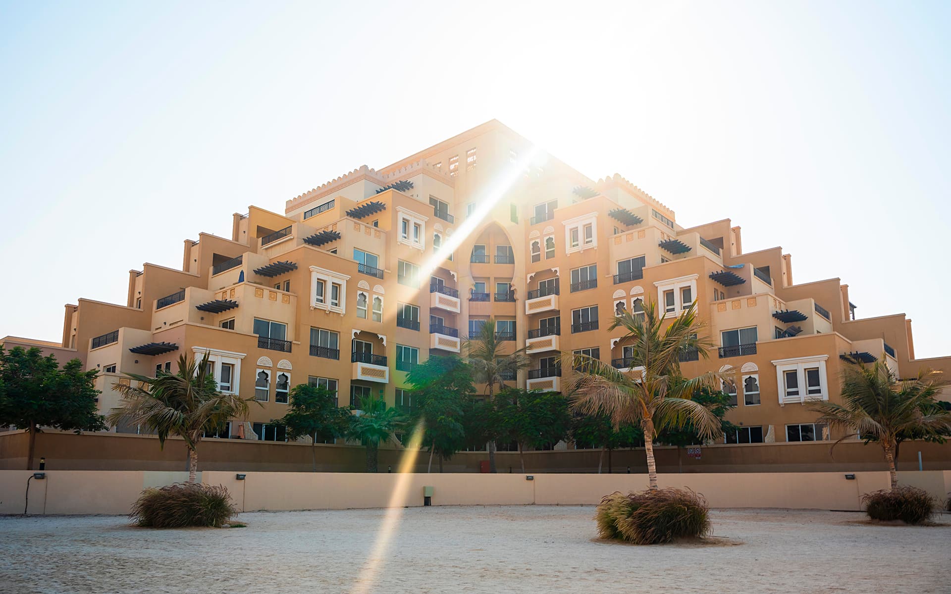
We rarely think consciously about color temperature, but it profoundly affects how we experience spaces and how we remember them. The warmth of incandescent light versus the coolness of daylight creates not just visual differences but emotional ones. Understanding this relationship has transformed how I approach interior photography.
The Psychology of Warm and Cool
Warm light, in the 2700-3000 Kelvin range, creates feelings of comfort, intimacy, and relaxation. It reminds us of candlelight, firelight, sunset. Cool light, from 4000-6500 Kelvin, feels clean, energizing, professional. It evokes daylight, alertness, clarity.
Neither is inherently better. Each serves different purposes and creates different moods. A luxury residential space might be lit predominantly with warm light to emphasize comfort and elegance. A modern office might use cooler light to promote focus and productivity. My job as a photographer is not to impose a single aesthetic but to capture the intended character of each space.
The Challenge of Mixed Lighting
The most common challenge in interior photography is mixed color temperatures. Natural daylight coming through windows is cool, around 5500K. Interior artificial lights are typically warm, 2700-3000K. When both are present, the camera sees what our eyes naturally balance. In the photograph, warm areas look orange and cool areas look blue. The space looks unnatural.
I have three approaches to this challenge. First, I can time the shoot for the hour when natural and artificial light are most balanced, usually dusk. Second, I can use gels on my lights to match the ambient color temperature. Third, I can bracket exposures for different light sources and blend them in post-production. Each approach has its place depending on the project requirements and the character of the space.
But technical solution alone is not enough. I must first decide what emotional tone the photograph should carry. Should it feel warm and inviting? Cool and sophisticated? This decision guides all subsequent technical choices.
Memory is Warm
I have noticed something interesting over years of working with clients. When people remember beautiful spaces they have experienced, they almost always recall them as warmer than they actually were. Memory has a bias toward warmth. This is why slightly warming an image in post-production often makes it feel more true to how people remember the space, even if it is technically less accurate to the actual light.
This is not about deception but about emotional truth. A technically perfect photograph that feels cold will fail to evoke the response the space deserves. A slightly warmed image that captures the feeling of being there succeeds even if the color temperature meter would disagree. Photography is not pure documentation. It is interpretation in service of truth.
Color temperature is one of the most powerful yet least discussed tools in architectural photography. It shapes perception, creates mood, and influences memory. Learning to see and control it deliberately rather than leaving it to chance has been one of the most significant evolutions in my work. Every space has its optimal color temperature, the one that best expresses its character and purpose. Finding that temperature is part of the craft.


